Portfolio
Every story starts with a spark – a wild idea, a curious “what if”, a shared vision to create something meaningful. Explore selected design projects and creative journeys I’ve been a part of – each bearing its own distinctive signature, yet all sharing a common thread: a deep love for building visual worlds that actually feel like the people behind them.
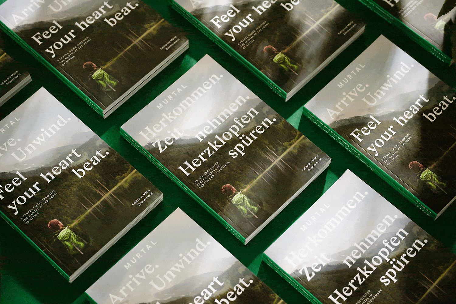
Murtal Travel Guide
Arrive. Unwind. Feel your heart beat. This travel guide through Austria’s Murtal leads you through the wonderful year there, season by season, step by step, place by place. Spring, summer, autumn and winter – a section for each amazing part of the year. The playful and colourful design turns this cheeky, friendly writing, with Michael Königshofer’s amazing photography, into a visual adventure, truly reflecting the mountains, the valleys, culinary delights of the region, brought to life by its extraordinary characters and makers. Author Katharina Maria Zimmermann knocked on the doors of a smith, a barrel maker and an alpaca owner and many more.

Licht- und Schattenspiele
The Styrian region Eisenstraße has long-standing connections with mining and steel production sites with hidden cultural treasures both above and below ground. The ancient songs, tales and stories of the region often feature the interplay between light and darkness, and that contrast of shadows and luminescence is also the common thread that runs through this book. A book that reflects the arcane aura of myth legend, such as the Celtic goddess Borbeth and her Christian successor Saint Barbara. To emphasise this stark contrast, the book is in two parts, differentiated by the use of two different types of paper, with the mid-section interviews in a glossy, light-reflecting style.

(R)EISEN
(R)EISEN takes its readers on a journey around the complex topic of iron production and processing. But time doesn’t stand still – an emerging baker, an innovative beer brewer or a young Lederhosen-fabricant embellish the book with their unique stories and anecdotes. Inspiration for the editorial design originated in typical symbols and characteristics of iron mining. The diverse color palette pays homage to the various conditions of iron itself – steel grey, rusty red or shiny silver. Rough around the edges, the chosen typography gives the book a classic yet contemporary feel, its serifs reminiscent of the infamous symbol featuring hammer & pick.

Leoben Chronicles
In cooperation with the MuseumsCenter & the City of Leoben, I was in charge of art direction & editorial design for the city’s official self-titled photo chronicle. A new color theme & modular layout were developed to accompany the extensive use of large-scale imagery and create a more contemporary look. Picking up on the theme of mining & steel production the area is commonly known for, hard edges & pointed serifs are echoed in the almost chiseled typography.