Portfolio
Every story starts with a spark – a wild idea, a curious “what if”, a shared vision to create something meaningful. Explore selected design projects and creative journeys I’ve been a part of – each bearing its own distinctive signature, yet all sharing a common thread: a deep love for building visual worlds that actually feel like the people behind them.

LUST — Lukas Strobl
When grapes dream, waves break against their roots. Like long ago, when the sea still stretched as far as the Weinviertel, the Austrian »Wine Quarter«, and when Wagram was still called »Wogenrain«, referring to a seashore. This story serves as the basis for the visual interpretation of Lukas Strobl’s wines.

Beerenberg
This mountain is more than a mere place. It's a space of resonance, of life itself, and it's a »Personal Everest«. The people behind Beerenberg live and grow with and around it. One could also call it a »Mountain of Discovery«. Concept, web design, and photography are based on the idea of an open end, on dreaming, and on not always having to finish telling a story right away.

Metha
Metha takes its name from the Slovenian word for “mother,” forming the foundation for the brand’s visual identity. The illustrated female figure serves as the emblem of the soap – embodying a holistic connection to the healing plant and to nature itself. The custom logotype, paired with organic type elements, reflects a design language that feels natural, grounded, and deeply rooted in the landscape from which it was born.

Karma Food
The Karma Food world includes a recipe platform, catering business, cooking classes, events, their very own cookbooks, and a wide range of specially created products, all centered on Indian cuisine. I had the pleasure of supporting Karma Food in the creative process for their product line, and developed the visual language of the packaging. Reminiscent of vintage Indian packaging and matchboxes, the headline typography mimics the slightly offset printing and reinterprets it in a contemporary way. A bright color palette rich in contrast creates a striking, distinctive look and simultaneously blends perfectly into the colorful world of Karma Food.
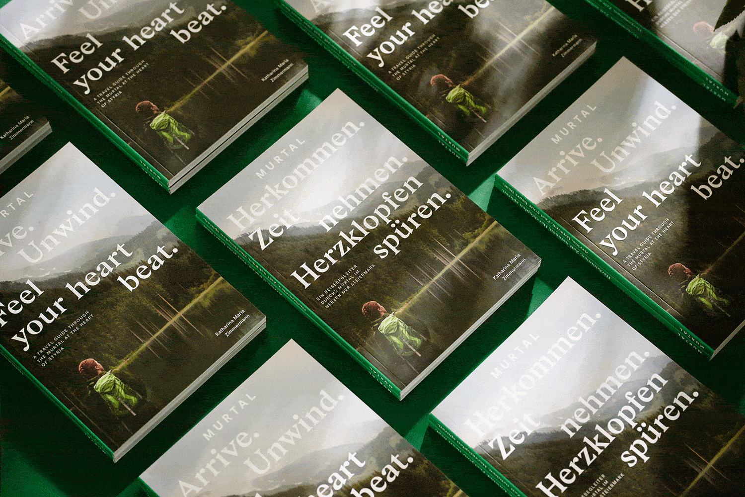
Murtal Travel Guide
Arrive. Unwind. Feel your heart beat. This travel guide through Austria’s Murtal leads you through the wonderful year there, season by season, step by step, place by place. Spring, summer, autumn and winter – a section for each amazing part of the year. The playful and colourful design turns this cheeky, friendly writing, with Michael Königshofer’s amazing photography, into a visual adventure, truly reflecting the mountains, the valleys, culinary delights of the region, brought to life by its extraordinary characters and makers. Author Katharina Maria Zimmermann knocked on the doors of a smith, a barrel maker and an alpaca owner and many more.

MOWO
MOWO's seating furniture is innovative, of the highest quality, and sustainable on all levels. The variations of the logo that emerged during the development process incorporate the curved shapes of the furniture. In combination with a fresh color palette, clean typography, and an imaginative visual world, it represents the character and style of the brand, as well as the furniture pieces themselves.

Inner Bloom
At »Inner Bloom«, acupuncture and holistic healing methods restore balance to body, mind, and soul, helping patients to flourish from within. The brand's visual identity artfully intertwines these themes of blossoming, balance, and holistic wellbeing — creating a harmonious composition from logo to brand mark, graphics, and photo concept.

Matternity
The consultancy »Matternity« stands for big ideas, new ways of thinking, and a clear vision to develop creative concepts that transcend traditional consulting – creating positive changes for brands, businesses, and society. A modern color-blocking system flows throughout the design, highlighting Matternity's unique approach and strategy toolkit. For social media applications, a secondary visual language introduces a more playful style, putting »ideas that matter« in focus.

Licht- und Schattenspiele
The Styrian region Eisenstraße has long-standing connections with mining and steel production sites with hidden cultural treasures both above and below ground. The ancient songs, tales and stories of the region often feature the interplay between light and darkness, and that contrast of shadows and luminescence is also the common thread that runs through this book. A book that reflects the arcane aura of myth legend, such as the Celtic goddess Borbeth and her Christian successor Saint Barbara. To emphasise this stark contrast, the book is in two parts, differentiated by the use of two different types of paper, with the mid-section interviews in a glossy, light-reflecting style.

Stonemade
Stonemade is craftsmanship, but for once, it isn’t humans making the rules here. It is Nature who has left her mark on each and every one of the plates and bowls. »There is a crack in everything. That’s how the light gets in« – so said Leonard Cohen, thereby providing a clear direction for imagery, text, and design. Stone’s imperfection is captured in the aesthetic of the logo typography, accompanied by a minimalist font. Within the photography, the interplay of light and shadow features through different interpretations.

Mindful Cosmetic
With her cosmetic studio, Mindful Cosmetic, Sandra Papst has created a special place in the middle of Graz – a space in which to calm down and treat oneself. The whole concept is all about coming closer to one’s own self, step by step. The experience is captured within the visual language – the photography displays this careful approach to the self, diving deeper beneath the surface with every layer, all the way into a feeling of complete well-being and comfort.

Alt-Prerau
Considering humans, animals, plants and soil as a holistic cycle – this is the core philosophy of biodynamic agriculture and the estate »Alt-Prerau«. An updated look and feel for the existing identity was created by introducing a fresh color palette and modern typography, while still keeping its original essence and paying respect to established design elements. The result is a contemporary brand rooted in tradition, reflecting the Demeter estate’s commitment to thinking ahead while preserving and developing the legacy of their ancestors.

Free Therapy
What does psychotherapy look like in the 21st century? The goal Free Therapy’s founders – psychiatrists and psychotherapists themselves – is to free psychotherapy from outdated beliefs and stigmata, and to make it more accessible through wellness objects that emphasize self-care and mindfulness. The wording »Free your...« expresses a brand new mindset. Through playful placements of the phrases on the various objects, a space for fresh thoughts is created.

(R)EISEN
(R)EISEN takes its readers on a journey around the complex topic of iron production and processing. But time doesn’t stand still – an emerging baker, an innovative beer brewer or a young Lederhosen-fabricant embellish the book with their unique stories and anecdotes. Inspiration for the editorial design originated in typical symbols and characteristics of iron mining. The diverse color palette pays homage to the various conditions of iron itself – steel grey, rusty red or shiny silver. Rough around the edges, the chosen typography gives the book a classic yet contemporary feel, its serifs reminiscent of the infamous symbol featuring hammer & pick.

Leoben Chronicles
In cooperation with the MuseumsCenter & the City of Leoben, I was in charge of art direction & editorial design for the city’s official self-titled photo chronicle. A new color theme & modular layout were developed to accompany the extensive use of large-scale imagery and create a more contemporary look. Picking up on the theme of mining & steel production the area is commonly known for, hard edges & pointed serifs are echoed in the almost chiseled typography.

Floravere
Floravere is a luxury bridal fashion brand, born in Los Angeles. The brand offers a curated collection of gorgeous wedding gowns and delivers them right to your doorstep – without the hassle of endless appointments and sample sales. Designed and exquisitely crafted by couture artisans, the dresses are custom-made and never off-the-rack. The archeress became the emblem of Floravere. Her arrow is a delicate Camellia flower, a symbol for young lovers. Based on ancient Greek goddesses, the archeress embodies confidence, strength & beauty – just like the Floravere bride herself. Representing the chic & effortless character of the Floravere brand, the vintage illustrations of flying, floating and hovering objects add an airy playfulness to the design and capture the joy of getting married.